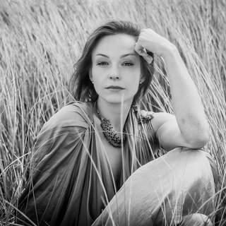
The monochrome choice works here; it strips away distraction to focus on form and texture. The lighting is the strongest element—the striped shadows cut across the frame with precision, creating a rhythmic visual pattern that leads the eye through the composition. The angle feels natural rather than staged. Good structural use of negative space in the background.
Simon, did you plan the angle from above to emphasize the geometry of the room?
35PHOTO Mobile App
Upload photos to the site directly from the mobile application. Like, subscribe to other participants, leave comments. The ability to watch those who like you, as well as the ability to upload works to the application for participants who have not passed moderation.


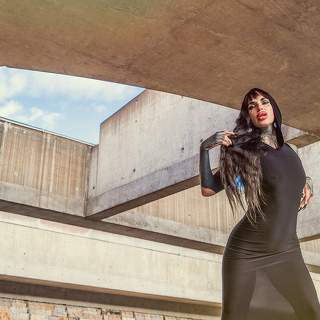


Simon, did you plan the angle from above to emphasize the geometry of the room?